Best Technical Indicators for Identifying Entry and Exit Points
Getting prepared to take that first plunge into trading stocks on the ASX requires a significant amount of time spent learning the rules of the game. At the onset, most newcomers to share market investing learn there are two broad approaches to evaluating specific stocks for potential buys –fundamental analysis and technical analysis.
Fundamental analysis gets the most play since it involves looking at common sense facets of a business operation – top line revenue and bottom line profit, product breadth and width, competition, corporate management, and historical and future growth.
Hard core proponents of fundamental analysis avoid the mathematically complex technical indicators, yet every time they check a price movement chart of a target stock on their trading platform or a financial website they have entered the wonderful world of technical analysis.
The “holy grail” for fundamentalist is the “intrinsic” value of the company behind the stock. The current stock price is not as important as what the investor can learn about the true value of the company. The stock price does not always reflect the value of the company. The stock price reflects the collective sentiment of investors in the market. In truth, the price of a stock reflects sentiment, not reality.
Top Australian Brokers
- Pepperstone - Trading education - Read our review
- IC Markets - Experienced and highly regulated - Read our review
- eToro - Social and copy trading platform - Read our review
The technicians believe the stock price over time is the holy grail. Technical analysis may use mathematical formulas, but the underpinning of the approach is market psychology. The theory is that over time the collective psychology of investors driving the stock price will follow patterns that repeat over time.
At the top of a standard price movement chart investors will find a button marked Indicators. Clicking the button reveals a long list of technical indicators built into the platform software. No need to do the math, it is done for you. Click on the indicator of your choice and the indicator is overlayed on the price chart of the target stock. From the ASX website, here are the first steps in applying technical analysis to BHP Group, one of the largest stocks on the ASX.
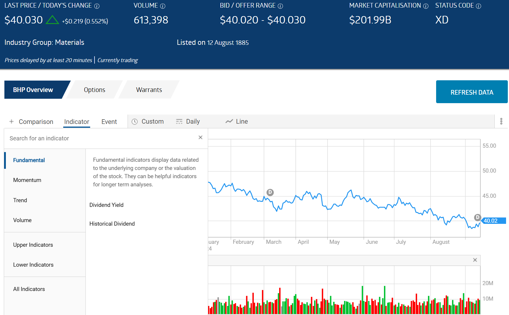
On the upper right of the chart you see the four categories of groupings of technical indicators –
- Fundamentals
- Momentum
- Trend
- Volume
Momentum and trend indicators go hand in hand and are arguably the most beneficial to the majority of technical traders. Stocks trade “range-bound” side to side, or in upward and downward trends. Momentum indicators gauge the speed and strength of the trend while Trend indicators can signal potential changes in the price movement of a trending stock.
Here are some of the best trend and momentum technical indicators.
- Moving Averages
- Relative Strength Index (RSI)
- Bollinger Bands
- Moving Average Convergence/Divergence (MACD)
- Stochastic Oscillator
Moving Averages
Moving averages smooth out the many fluctuations in price by adding the closing price of the stock and dividing by the number of days averaged, with the most popular being the 50 Day and the 200 Day.
Exponential moving averages assign a higher weight to the most recent closing prices rather than treating them all equally. This makes the EMA superior to the SMA for short term traders.
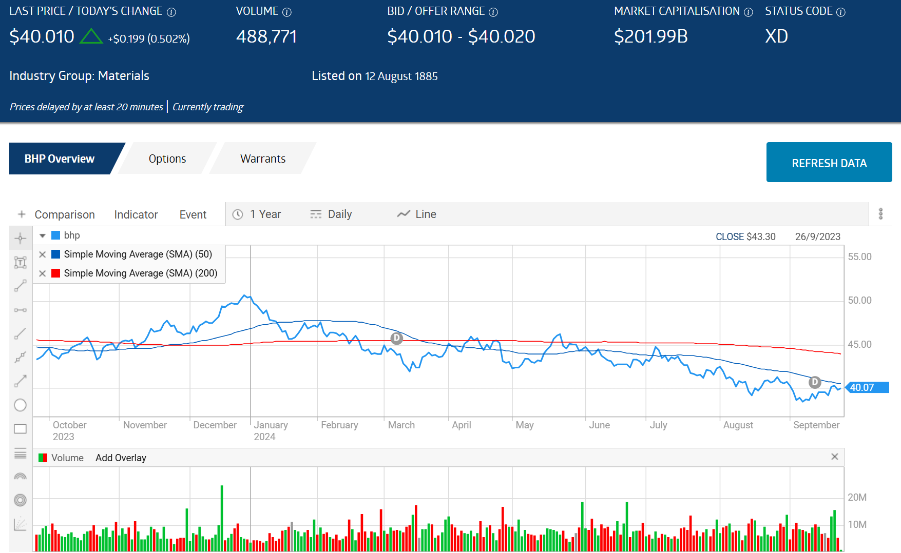
Here is how a 50 Day SMA and a 200 Day SMA appears on a one year chart for BHP.
Source: ASX
The advantage of SMAs is identifying crossovers, when the 50 SMA crosses above the 200 Day SMA – a BUY signal; and when the 50 Day crosses under the 200 Day – a SELL signal.
In the chart, the Blue line (50 Day) crossed over the Red line in late November, flashing a BUY signal, and crossed under in April, flashing a SELL signal.
Moving averages are lagging indicators, which is the drawback mentioned by some analysts. A lagging indicator might spot the trend reversal, but it comes late, limiting the profit potential for investors. In the chart the November BUY signal got the upward movement accurately but was too early with the April SELL signal.
Relative Strength Index
The RSI acts as both a momentum and trend indicator, one of a few indicators that establish upper and lower boundaries ranging from 0 to 100, with the index “oscillating” between those values based on changes in the share price.
The RSI is arguably the easiest technical indicator to use, with the software doing all the work for you. The upper and lower limits identifying overbought or oversold conditions are set at 70 and 30, although some charts allow investors to go with 80 and 20, a more reliably accurate standard. SELL signals flash when the RSI crashes into the upper limit of 70 or 80, indicating the stock is”overbought,”and ripe for a reversal. When the RSI slips under 20, BUY signals flash as the now oversold stock may be poised for an upward reversal.
From the ASX website here is the RSI for a one year chart for one of the hottest stocks on the ASX in 2024 – ProMedicus (PME).
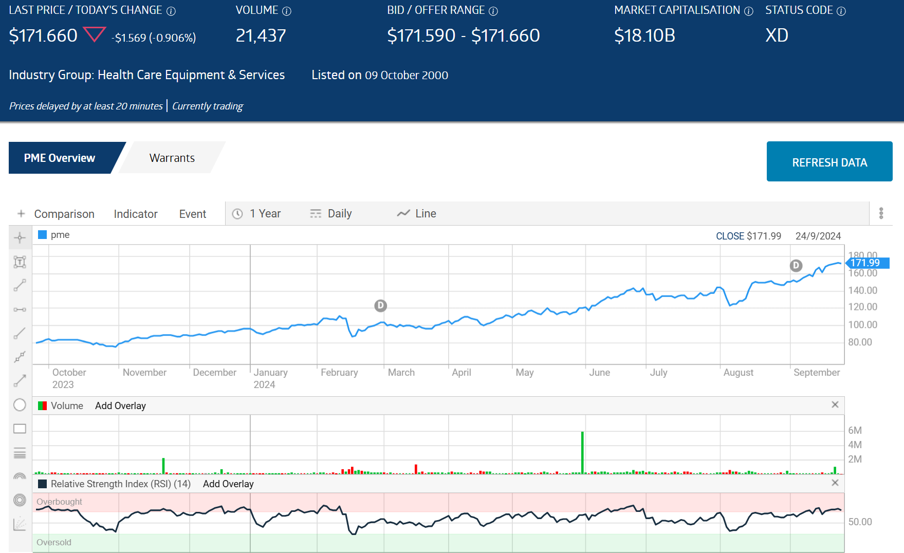
You can see when the RSI went into the pink, the stock price dropped and went up when the RSI went green or crept close. The downside noted by some expert traders is the indicator requires quick reaction to get maximum benefit.
Bollinger Bands
Many investors follow the advice of the majority of experts not to rely on a single technical analysis indicator to make investment buying and selling decisions.
Bollinger Bands target the same overbought/oversold conditions uncovered by the RSI following a different and overly complex method of calculating the bands. Investors concerned about the accuracy of RSI signals can compare them to signals generating from Bollinger Bands
There are two bands appearing as lines on a price chart. The upper band is two standard deviations above the moving average of twenty time periods set by the user — minutes, days, weeks, or more. The 20 time period MA appears as a line between the two bands on the chart. The lower band is two standard deviations below the moving average (MA).
From the ASX website we added Bolling Bands to the one year price movement chart for BHP to the RSI indicator displayed in the previous chart.
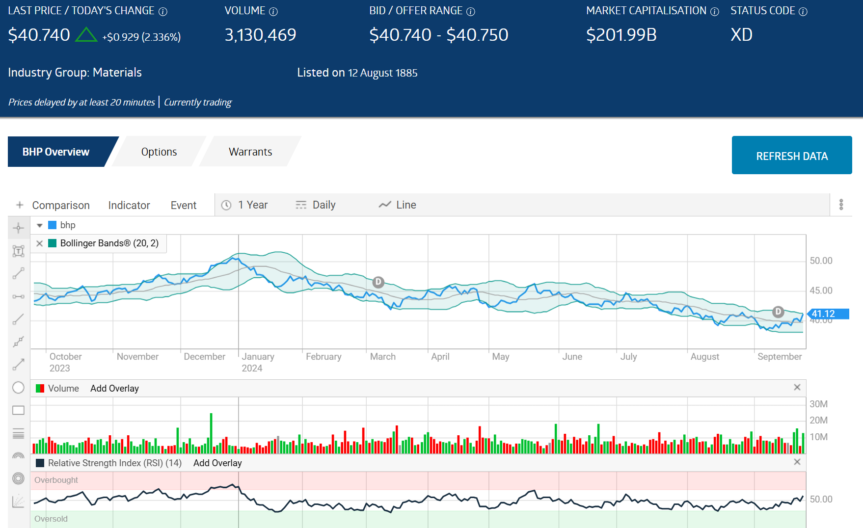
You can see that both technical indicators spotted upcoming trend reversals when the share price – the blue line in the chart – touched the upper or lower limit of the indicator.
Bollinger Bands are based on a strong mathematical concept – reversion to the mean. Reversion to the mean suggests that a stock’s price will return to its historical average over time.
Expert technical traders caution when using Bollinger Brands with a stock in a strong trending pattern. The issue is the BUY and SELL signals can appear too soon.
Moving Average Convergence/Divergence
The Moving Average Convergence/Divergence (MACD) technical indicator charts the relationship between two exponential moving averages – a 26 day and a 12 day.
The end result of calculating the MACD is two lines – the MACD line and the Signal Line, supported by a histogram. For this indicator we are using a chart from the investing website investopaedia.com.
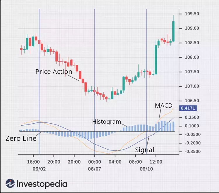
The MACD line is calculated by subtracting a 12 day EMA (exponential moving average) from a 26 day EMA. The result is then charted over a nine day period to create the SIGNAL line.
BUY signals flash when the MACD line crosses above the Signal line with SELL signals flashing when the MACD line crosses below the Signal line.
Stochastic Oscillator
Stochastics are another momentum oscillator also identifying overbought and oversold conditions based on a different set of assumptions used to calculate the indicator.
The stochastic oscillator compares a targeted stock’s closing price to a range of its prices over a certain period of time, with 14 being the most frequently used period of time. The time period can be set to minutes, days, weeks, months or years to match the trading approach of the user.
The indicator creates two lines — %K and %D. The K line appears above the D line on charting and represents the relationship of the range of closing prices over the time period while the D line is a moving average of the K line over three periods.
The price charting software on the ASX displays a “fast” and a “slow” indicator, with the fast calculated with the standard 14 day time period and the slow using a 3 day time period. Here is how it looks for BHP’ share price over one year.
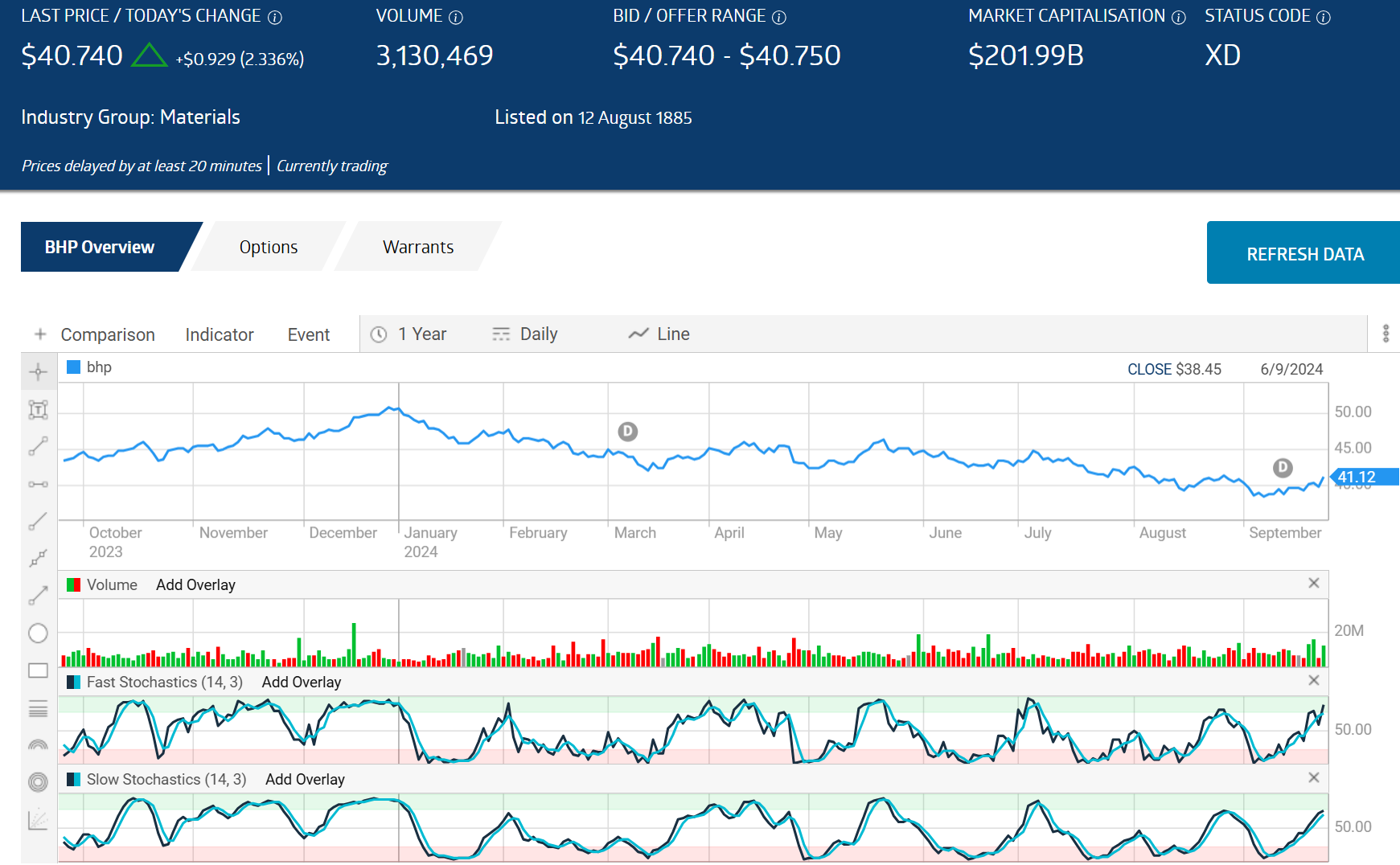
Source: ASX
Fast Stochastics are more sensitive to price changes and generate more signals, as you can see in the chart. Slow stochastics generate more accurate BUY/SELL signals.
While investors favoring fundamental analysis look for the aspects of a stock’s business that make up its “intrinsic value,” those favoring technical analysis use readily available technical indicators from price movement charting to assess potential reversals in the price movement over time.
Technical indicators are not always 100% accurate but some do point to potential reversals in price signaling BUY or SELL. Technical indicators generating clear BUY and SELL signals may be the best for the majority of ASX investors. These include Moving Averages, the Relative Strength Index, Bollinger Bands, Moving Average Convergence/Divergence (MACD), and Stochastic Oscillators.


