Reading Stock Charts
Welcome to the fourth part of our short course on the basics of investing. So far we have looked at the mechanics of stocks and the stock market in lesson one, we looked at how to research shares in lesson two and we covered investment strategies and fundamental analysis in lesson three.
Lesson four will look at technical analysis and how to interpret price charts. We will cover:
- What is technical analysis?
- Different types of price chart
- Support and resistance levels
- Price action trading
- Chart patterns
- Technical indicators
Technical Analysis
While fundamental analysis involves using ‘real world’ information to guide trading decisions, technical analysis is driven by one type of input: market data. In its simplest form, it involves examining how the price of an asset changes over time to determine where prices might go next.
Other elements of technical analysis incorporate different types of market data, such as trade volumes, long-term price averages, and price volatility levels. This data can be processed in various ways to produce different readings in the form of technical indicators. As the readings from these indicators change over time, they can reveal insights into market conditions and highlight potential opportunities
Top Australian Brokers
- Pepperstone - Trading education - Read our review
- IC Markets - Experienced and highly regulated - Read our review
- eToro - Social and copy trading platform - Read our review
Timeframes and Types of Chart
Price charts are plotted over different timeframes. Price data can be logged at various intervals from every month or year right down to every minute or every second. Different timeframes are useful for different kinds of investors. Traders looking to make quick profits from short-term price movements tend to use shorter intervals on their charts, usually 15 minutes or less. Investors looking to build wealth over the long term tend to use longer timeframes of a day or more.
Weekly and daily charts are most common for long-term investors as they allow a wider perspective. They are less cluttered by short-term fluctuations which can look huge over shorter timeframes and become a distraction.
There are many different ways to plot price charts. The simplest being the line chart, with the closing price of each period forming a simple line. Line charts are a great starting point as they show you only a closing price over a period of time, with no other distractions.
The most common type of chart is the candlestick chart. They can be intimidating at first glance as they show much more information than line charts. As well as the closing price, candlestick charts also show the opening price, the price high and the price low for the period. This extra information can provide deeper insight than a simple line chart.
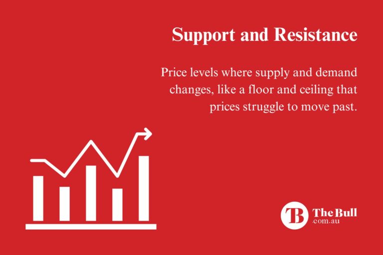
Support & Resistance
One of the most useful concepts in technical analysis is that of support and resistance levels. These are price levels on a chart that act like barriers that the asset price struggles to move beyond. A resistance level is best likened to an upper ceiling and a support level can be seen as the metaphorical floor.
These levels can be found by looking for points on the chart where prices stopped and reversed. The more times this happens at around the same level, the stronger and more significant this level becomes. Round numbers can also act as support and resistance levels because of their psychological importance.
Once support and resistance levels have been identified, a simple strategy would be to buy when the price of an asset ‘bounces’ off a support level, and sell once it reaches the resistance level.
Support and resistance levels are not permanent, however, and eventually will be broken. Opportunities can arise when this happens – for example, it could be time to buy when a resistance level is broken, and vice versa.
Price Action
Price action is simply the term used to explain how price levels move on a chart over time. Some traders rely exclusively on price action to guide their decision-making, with their analysis helped by features such as support and resistance price levels.
As well as support and resistance levels, price action traders look for things like trendlines, channels and other significant patterns that may give insight into where prices may go next.
Price charts can be interpreted in different ways, so price action can be subjective. This can lead traders to make different decisions based on the same information.
Chart Patterns
Chart patterns are distinctive formations created by movements of the price of an asset and are one of the main elements of technical analysis. Patterns are formed by drawing lines between key points on the chart, such as recent price highs or lows. These patterns help traders anticipate where the price of an asset might go next.
These patterns fall into two categories – continuation patterns and reversal patterns. A continuation is a temporary pause in an existing trend before prices continue in the same direction. These patterns form when buyers or sellers stop to take some profits before continuing, and so there is a pause in the buying or selling pressure.
Reversal patterns form at the end of a trend, when the price of an asset stops and reverses. These patterns form when buying or selling pressure runs out and the opposite takes over, with sellers taking over at the end of an uptrend and vice versa.
There are many different patterns, from simple shapes such as wedges, triangles and flags to more complex formations like the cup and handle, head and shoulders and double tops/bottoms. Spotting these patterns is another way for traders to predict where the price of an asset will go next.
Technical Indicators
Market data – such as price, volume and volatility – can be processed in various ways to produce readings that can help predict where prices may go next. These readings are called technical indicators.
The two basic types of indicators are overlays and oscillators. The readings from overlay indicators are plotted on top of the price chart to the same scale. Overlay indicators include moving averages and bollinger bands.
Oscillators are indicators that produce a reading between a minimum and a maximum value, usually 0-100. These indicators produce buy or sell signals when they pass above or below certain values. Examples of oscillators include the RSI, the MACD and stochastics.
Traders will often combine multiple indicators, along with price action analysis and chart patterns, to help confirm the best times to enter and exit trades.
Key Points
- Technical analysis is the study of market data in order to make predictions about the price of an asset.
- Price charts show how the price of an asset changes over time. They display this data in different ways and over different timeframes.
- Support and resistance levels are areas on a chart where prices stopped their movement and reversed.
- Price action is a term used to describe how the price of an asset moves over time
- Chart patterns are distinctive formations created by movements of the price of an asset.
- Technical indicators use different kinds of market data to produce readings that can provide buy and sell signals